UI Components
Text Sizing
Colors

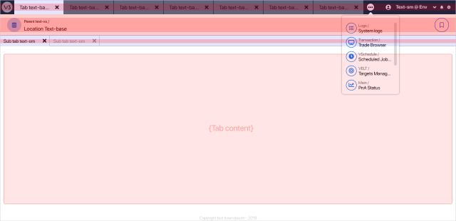
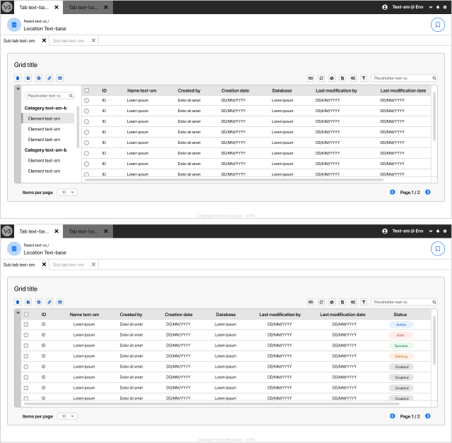
Tabs and viewport optimization
Due to routing restrictions, the former layout presented significant friction in opening multiple workspaces at the same time. The addition of a parent tab level opens the possibility to solve this without compromising cognitive load, while also contributing to overall system agility in task completion.
Grid component
The grid presents two opportunities for improvement:
- A- By collapsing the categories side panel, it is possible to improve grid’s readability by expanding its width to the total size of the container.
- B- Grouping all the buttons related to a grid inside the component’s layout, can contribute to an easier reading of the window.
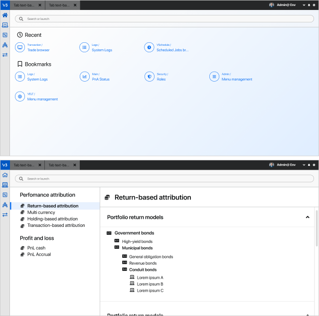
Start screen
Users claim that the start screen provides no value to them after the first login to the system. This space is an opportunity to improve system performance by using it to display the access to its utilities.
